


![]()
![]()
News :: New Logo, Who Dis?
Not many brands these days go for 12 years without a refresh, but it felt like after the enforced break we've had over the past 12 months and excitement of bringing everyone back together later this year, it was time for us.
So welcome to the new EPIC.LAN brand that we'll be rolling out fully over the coming weeks, once we manage to track down everywhere we had the old one!
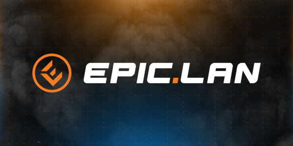
Normally at this point in rebranding projects, we'd go in to the details of the vision and how the angle of each letter represents some part of our core identity or something that justifies the millions that branding agencies earn.
But this was a pretty simple brief, we were fond of our old logo, we'll miss it, but it was becoming a bit of a pain to work with by modern design standards and it just looked a bit...old, particular against the new graphics our creative team assembled for the last event.
So we quite simply asked the design wizards at Hotdrop to come up with something that we could easily drop in to the general EPIC.LAN look and feel while giving things a lift. So the orange/black/white combo is staying, and we couldn't get rid of the EPIC DOT after all this time, but it's just cleaner, more modern and we have a number of variations that we will be using to suit the applications it's needed for.
Importantly, with how logos are used these days, particularly in social media, having a standalone icon that over time will hopefully become recognised with the rest of the brand was important too.
It's still been quite a lengthy process that we've been discussing ideas and going back and forth with the designers over a number of variations over the past few months, but eventually we narrowed it down to this version and we're excited to show off the new lick of paint to everyone ready for EPIC33 in July (whatever that looks like as an event at this stage).
And that's literally the whole story of the new logo.